Choose layout before color
A template is more than a palette. Navigation, homepage rhythm, hero structure, service presentation, news layout, contact details, footer, and mobile behavior all shape how families experience the cemetery website.
A parish cemetery may need a reverent pastoral layout. A municipal cemetery may need clear public-service navigation. A private cemetery may need a calmer memorial-focused design.
Preview with realistic content
Template previews should show plausible cemetery names, services, notices, images, contact details, and search examples.
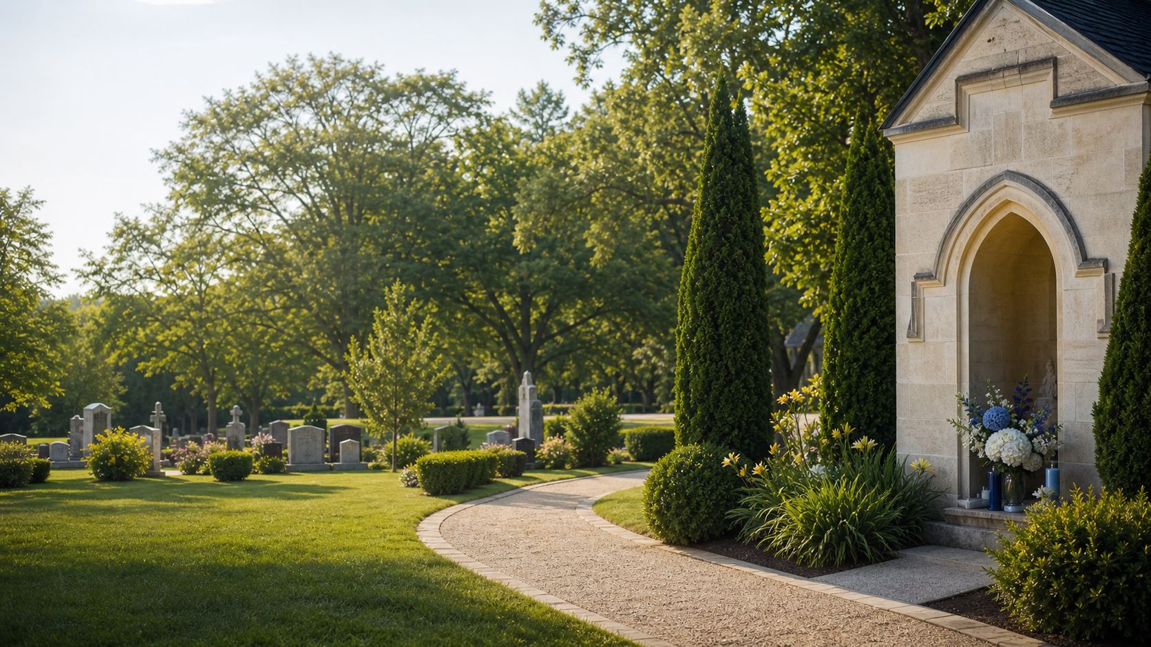
Realistic images matter too. Cemetery software should avoid cartoonish visuals, unrelated old assets, and repeated images that make templates feel interchangeable.
- Check whether the logo is readable.
- Confirm service and news cards have space for images and summaries.
- Review mobile navigation and contact paths.
- Choose a design that fits the cemetery's tone, not only favorite colors.
Make sure empty sections disappear
A template should look complete when a cemetery has three news posts, one service, no testimonials, or no videos.
Empty wrappers and placeholder copy damage trust. Review how the style behaves with less content as well as with a full demo.